- Using PVAAS for a Purpose
- Key Concepts
- PEERS
- About PEERS
- Understanding the PEERS pages
- Evaluation List
- Evaluation Summary
- Evaluation Forms
- Add Educator
- Add Evaluator
- Manage Access
- Add a school-level Educator to PEERS
- Add a district-level Educator to PEERS
- Add the Evaluator permission to a user's account
- Remove the Evaluator permission from a district user's account
- Add the Evaluator or Administrative Evaluator permission to a district user's account
- Remove the Administrative Evaluator permission from a district user's account
- Remove an Educator from PEERS
- Restore a removed Educator
- Assign an Educator to a district-level Evaluator
- Assign an Educator to an Evaluator
- Unassign an Educator from an Evaluator
- Assign an Educator to a school
- Unassign an Educator from a school
- Link a PVAAS account to an Educator
- Working with Evaluations
- Switch between Educator and Evaluator
- View an evaluation
- Use filters to display only certain evaluations
- Print the Summary section of an evaluation
- Understanding evaluation statuses
- Determine whether other evaluators have access to an evaluation
- Lock or unlock an evaluation
- Save your changes
- Mark an evaluation as Ready for Conference
- Release one or more evaluations
- Download data from released evaluations to XLSX
- Make changes to an evaluation marked Ready for Conference
- Reports
- School Reports
- LEA/District Reports
- Teacher Reports
- Student Reports
- Comparison Reports
- Human Capital Retention Dashboard
- Roster Verification (RV)
- Getting Started
- All Actions by Role
- All Actions for Teachers
- All Actions for School Administrators or Roster Approvers
- Manage teachers' access to RV
- Assign other school users the Roster Approver permission
- View a teacher's rosters
- Take control of a teacher's rosters
- Add and remove rosters for a teacher
- Copy a roster
- Apply a percentage of instructional time to every student on a roster
- Batch print overclaimed and underclaimed students
- Remove students from a roster
- Add a student to a roster
- Return a teacher's rosters to the teacher
- Approve a teacher's rosters
- Submit your school's rosters to the district
- All Actions for district admin or district roster approvers
- Assign other LEA/district users the Roster Approver permission
- Take control of a school's rosters
- View a teacher's rosters
- View the history of a teacher's rosters
- Edit a teacher's rosters
- Add and remove rosters for a teacher
- Copy a roster
- Apply a percentage of instructional time to every student on a roster
- Batch print overclaimed and underclaimed students
- Return a school's rosters to the school
- Approve rosters that you have verified
- Submit your district's rosters
- Understanding the RV Pages
- Viewing the History of Actions on Rosters
- Additional Resources
- Admin Help
- General Help
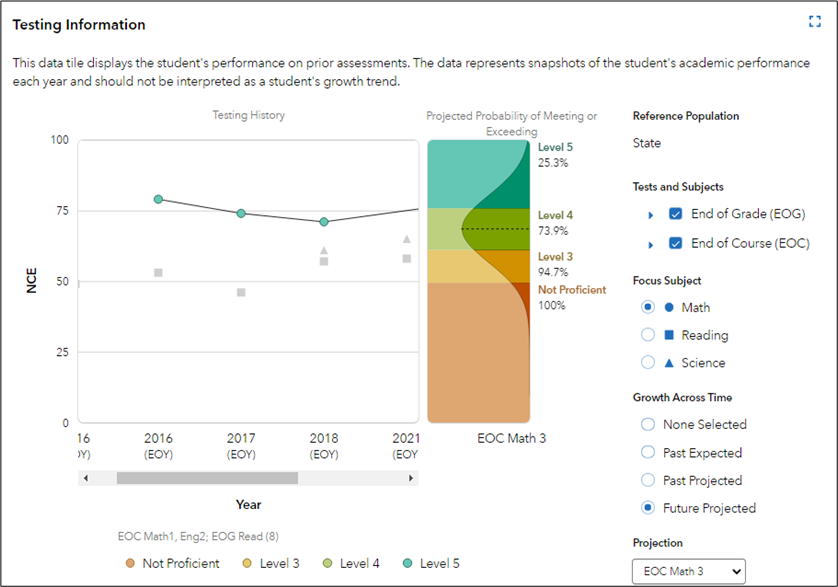
| Student Projection Report | 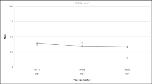 |
Understanding the Graph
Taking action based on students' projection probabilities can affect their academic outcomes. If a student's projection report indicates a low probability of reaching proficiency, and educators respond by providing additional support and interventions, the student may outperform the projection.
Student information is not available when the following is true:
|
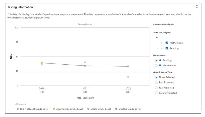
Student Testing History
Reference Population
The Reference Population refers to the population of students who took the available assessments. This reference is used as the comparison for analysis.
Focus Subject
Each graph displays selections with different colored shapes representing each subject. The shapes at the foreground of the graph represent the selected Tests and Subjects on the right Testing History panel. The gray shapes in the background represent other tests and subjects that have not been selected.
 | None SelectedWhen you select None Selected under the Growth Across Time options for the Testing History graph, you can view a visual representation of a child's testing history. None Selected provides child testing history across all subjects. |
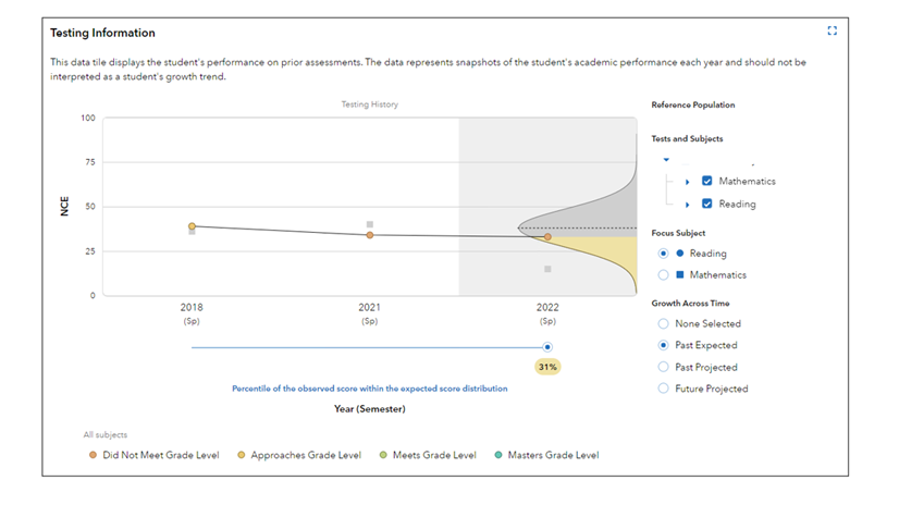 | Past PredictedWhen you select Past Predicted under the Growth Across Time options for the Testing History graph, you can view a visual representation of calculations based on the child's past testing history and current cohort of test takers.
|
| Future ProjectedWhen you select Future Projected under the Growth Across Time options for the Testing History graph, you can view a visual representation of calculations based on the child's past testing history and prior year's cohort of test takers.
|