- Using PVAAS for a Purpose
- Key Concepts
- PEERS
- About PEERS
- Understanding the PEERS pages
- Evaluation List
- Evaluation Summary
- Evaluation Forms
- Add Educator
- Add Evaluator
- Manage Access
- Add a school-level Educator to PEERS
- Add a district-level Educator to PEERS
- Add the Evaluator permission to a user's account
- Remove the Evaluator permission from a district user's account
- Add the Evaluator or Administrative Evaluator permission to a district user's account
- Remove the Administrative Evaluator permission from a district user's account
- Remove an Educator from PEERS
- Restore a removed Educator
- Assign an Educator to a district-level Evaluator
- Assign an Educator to an Evaluator
- Unassign an Educator from an Evaluator
- Assign an Educator to a school
- Unassign an Educator from a school
- Link a PVAAS account to an Educator
- Working with Evaluations
- Switch between Educator and Evaluator
- View an evaluation
- Use filters to display only certain evaluations
- Print the Summary section of an evaluation
- Understanding evaluation statuses
- Determine whether other evaluators have access to an evaluation
- Lock or unlock an evaluation
- Save your changes
- Mark an evaluation as Ready for Conference
- Release one or more evaluations
- Download data from released evaluations to XLSX
- Make changes to an evaluation marked Ready for Conference
- Reports
- School Reports
- LEA/District Reports
- Teacher Reports
- Student Reports
- Comparison Reports
- Human Capital Retention Dashboard
- Roster Verification (RV)
- Getting Started
- All Actions by Role
- All Actions for Teachers
- All Actions for School Administrators or Roster Approvers
- Manage teachers' access to RV
- Assign other school users the Roster Approver permission
- View a teacher's rosters
- Take control of a teacher's rosters
- Add and remove rosters for a teacher
- Copy a roster
- Apply a percentage of instructional time to every student on a roster
- Batch print overclaimed and underclaimed students
- Remove students from a roster
- Add a student to a roster
- Return a teacher's rosters to the teacher
- Approve a teacher's rosters
- Submit your school's rosters to the district
- All Actions for district admin or district roster approvers
- Assign other LEA/district users the Roster Approver permission
- Take control of a school's rosters
- View a teacher's rosters
- View the history of a teacher's rosters
- Edit a teacher's rosters
- Add and remove rosters for a teacher
- Copy a roster
- Apply a percentage of instructional time to every student on a roster
- Batch print overclaimed and underclaimed students
- Return a school's rosters to the school
- Approve rosters that you have verified
- Submit your district's rosters
- Understanding the RV Pages
- Viewing the History of Actions on Rosters
- Additional Resources
- Admin Help
- General Help
Teacher Reports for Admins
State/LEA/District/School Teacher Summary
Creating a Chart
 | To create a summary pie chart, select the tested grades and subjects or Keystone content areas you would like to include. To include all grades, subjects, and Keystone content areas, click Select All in the selection area. Then click Create New Graph. To view a pie chart for a different set of tests, subjects, or grades, make your selections and click Update Graph. |
You can also keep the original pie chart and create a second pie chart by making your new selections and clicking Create New Chart.
You can create up to eight different charts. To scroll through them, use the arrows to the left of the table and to the right of the chart, or click the dots above the table and chart.
Viewing Multiple Charts on a Single Page
If you've created multiple charts, it can be helpful to view them all on the same page. To do that, click View All Charts at the top-right of the pie chart. This opens a new window that displays all the charts you've created. To print or save the page, click Print in the top right of the window.
Understanding the Report
The results are displayed in a table and a pie chart. The table lists the number of teachers in the selected grades, subjects, and courses in each of the growth color indicators for the school, LEA/district, and state. The pie chart represents the distribution of teachers in the school or LEA/district for the selected grades, subjects, and courses. Each pie slice represents one of the growth color indicators. The color coding matches the colors used in the Teacher value-added reports and is explained in the legend below the table and chart. | 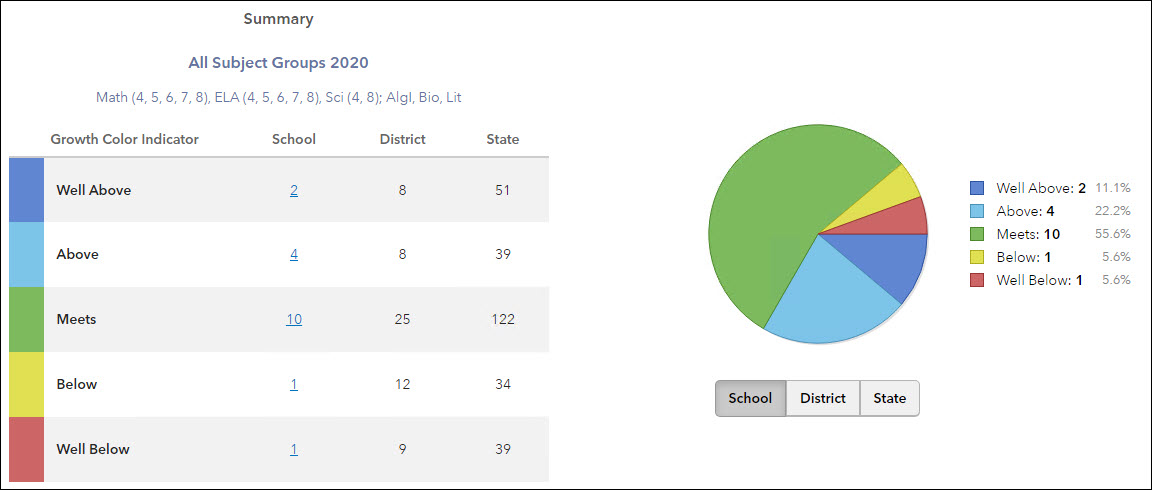 |
The size of each pie slice indicates the percentage of teacher growth indexes in the school or LEA/district with that growth color indicator. Position your mouse pointer over a pie slice or the corresponding row in the table to see the percentage.
To see the pie chart for the LEA/district or state, choose from the buttons below the pie chart.
Exercise caution when sharing these pie charts, especially when the number of teachers in a grade and subject or Keystone content area is very small.
Viewing the Teacher Reports
To view the list of teachers in any growth color indicator group, click on the underlined value in the table. The teachers are listed alphabetically by last name. Other columns display the test, subject, and grade (when applicable). The 0-100 Scale and 0-3 Scale columns list the teacher's converted scores. Values appear in these columns only for 3-Year Composites. Teachers can appear in the list multiple times, once for each grade and subject or Keystone content area.
To sort the list by any column, click on the column heading.
To view a Teacher Value-Added report for a specific grade and subject or Keystone content area, click on the teacher's name in the corresponding row.