- Using PVAAS for a Purpose
- Key Concepts
- PEERS
- About PEERS
- Understanding the PEERS pages
- Evaluation List
- Evaluation Summary
- Evaluation Forms
- Add Educator
- Add Evaluator
- Manage Access
- Add a school-level Educator to PEERS
- Add a district-level Educator to PEERS
- Add the Evaluator permission to a user's account
- Remove the Evaluator permission from a district user's account
- Add the Evaluator or Administrative Evaluator permission to a district user's account
- Remove the Administrative Evaluator permission from a district user's account
- Remove an Educator from PEERS
- Restore a removed Educator
- Assign an Educator to a district-level Evaluator
- Assign an Educator to an Evaluator
- Unassign an Educator from an Evaluator
- Assign an Educator to a school
- Unassign an Educator from a school
- Link a PVAAS account to an Educator
- Working with Evaluations
- Switch between Educator and Evaluator
- View an evaluation
- Use filters to display only certain evaluations
- Print the Summary section of an evaluation
- Understanding evaluation statuses
- Determine whether other evaluators have access to an evaluation
- Lock or unlock an evaluation
- Save your changes
- Mark an evaluation as Ready for Conference
- Release one or more evaluations
- Download data from released evaluations to XLSX
- Make changes to an evaluation marked Ready for Conference
- Reports
- School Reports
- LEA/District Reports
- Teacher Reports
- Student Reports
- Comparison Reports
- Human Capital Retention Dashboard
- Roster Verification (RV)
- Getting Started
- All Actions by Role
- All Actions for Teachers
- All Actions for School Administrators or Roster Approvers
- Manage teachers' access to RV
- Assign other school users the Roster Approver permission
- View a teacher's rosters
- Take control of a teacher's rosters
- Add and remove rosters for a teacher
- Copy a roster
- Apply a percentage of instructional time to every student on a roster
- Batch print overclaimed and underclaimed students
- Remove students from a roster
- Add a student to a roster
- Return a teacher's rosters to the teacher
- Approve a teacher's rosters
- Submit your school's rosters to the district
- All Actions for district admin or district roster approvers
- Assign other LEA/district users the Roster Approver permission
- Take control of a school's rosters
- View a teacher's rosters
- View the history of a teacher's rosters
- Edit a teacher's rosters
- Add and remove rosters for a teacher
- Copy a roster
- Apply a percentage of instructional time to every student on a roster
- Batch print overclaimed and underclaimed students
- Return a school's rosters to the school
- Approve rosters that you have verified
- Submit your district's rosters
- Understanding the RV Pages
- Viewing the History of Actions on Rosters
- Additional Resources
- Admin Help
- General Help
| School Diagnostic | 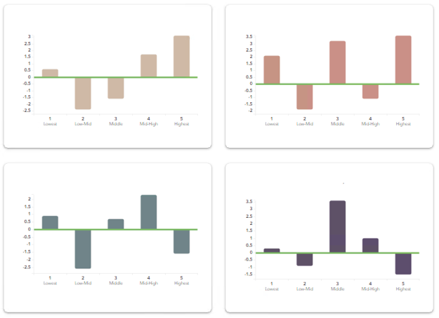 |
Understanding Graph Options
Select the graph option that helps you visualize the data you are investigating.
The meaning of the green line is based on the Measurement Option.
| Measurement Option | Green Line Represents |
|---|---|
| Growth | The growth standard |
Bar Chart
Use the bar chart to view the measurement option for each group of students.
Bar Chart with Confidence Bands
Use the bar chart with confidence bands to display information about statistical certainty.
Each bar has solid and dotted black whiskers. The solid whiskers mark one standard error above and below the growth measure, and the dotted whiskers mark two standard errors above and below the growth measure. It's important to consider the standard error as you interpret the growth measures represented by the bars on the chart. Consider the overall pattern of the bars rather than focusing on any individual value. However, it can be helpful to keep these guidelines in mind.
| A bar that is at least one standard error above the line suggests that the group's average achievement level increased. If the bar is at least two standard errors above the line, the evidence of growth is even stronger. |  |
| Likewise, if the bar is at least one standard error below the green line, the group likely lost ground academically, on average. If the bar is at least two standard errors below the line, the evidence is stronger. | 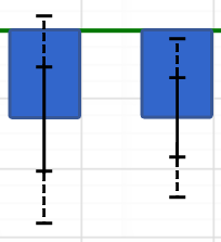 |
| Regardless of whether the bar is above or below the green line, if it is within one standard error of the line, the evidence suggests the group's average achievement did not increase or decrease. | 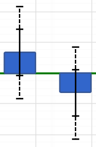 |
For more information about interpreting the charts, see Interpreting Common Patterns.
Box Plot
Use the box plot to view additional details about the data for each student group.
A box plot displays the five-number summary of a set of data. In a box plot, there is a box from the 75th percentile to the 25th percentile. A horizontal line goes through the box at the median, which is the midpoint of the frequency of the distribution. The black dot is the average. The whiskers show the minimum or maximum for each quartile.
A minimum of five students is required to view a box plot. Box plots are not available for measurements that are based on percentages.